GTM Periodic Table
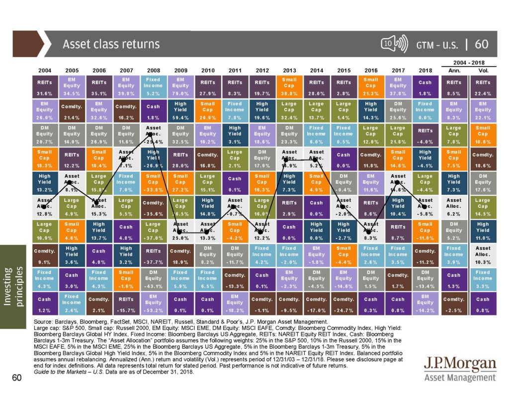
The chart below is what we call a “periodic table” of asset-type returns. Not only does the chart depict the return each calendar year of major stock and bond asset classes for the last 14 years or so, it also tracks a hypothetical diversified portfolio that is approximately 60% equities and 40% fixed income comprised of these asset classes (white boxes), a very common asset allocation. The two columns on the right side depict the rolling long-term averages of these investment elements in terms of both return, and volatility (standard deviation). While a 60/40 mix is not a universally appropriate asset allocation for everyone, the chart gives a pretty good indication of what a diversified portfolio return has produced historically.
Keep in mind that the asset classes and allocations are comprised of pure indexes (which investors can not invest directly in). They are gross returns with no reflection of the costs always associated with investing.